To Our Community
Many of you in our extended community of musicians, designers, researchers, and tech enthusiasts have asked me to tell the story behind the Music.AI brand identity. Did it come to us in a dream? Did lightning strike? Not exactly. It was an intentional effort by an ensemble of designers acting in concert to achieve a well-orchestrated outcome. Did I use enough musical metaphors there?
It’s not common for companies to develop new brand identities without the assistance of outside agencies. There’s nothing wrong with seeking objective third-party help in such a project, but we took a different approach. Design has always been core to everything we do. It’s central to how we think about our products, offices, swag, and even internal communications. It manifests in everything we do. That’s why we decided to take this on by ourselves.
Here’s the story behind the launch of Music.AI, our umbrella company's brand identity.
![]()
We've always envisioned our technology as a bridge between the digital and the musical, a companion in the creative process, and a tool that amplifies the artistry within each user. To create a brand identity representing our values, the first step we took as a design team was to brainstorm with our entire organization. We interviewed everyone, from our engineers to HR, our executives, office managers, and, of course, our marketing team, in order to best reflect our core values and mission. What emerged was a narrative centered on innovation, creativity, and robustness.
We took the time to consider the Music.AI values and mission and dove into the realm of visual identity. We wanted our logo to stand out and strongly resonate with our audience. It needed to represent sound and science, art and artificial intelligence, and boldly reflect the company’s mission to drive business outcomes through innovative AI-driven audio technology.
Motivation
The world of music and technology is constantly evolving. At its core, our company has always been about pioneering this frontier, developing AI that understands, complements, and enhances the musical creativity of human artists.
As designers, we sought to capture a transformative spirit and signal a new era for our company. A spirit that speaks directly to the innovative hearts of developers, creators, and AI researchers working in the music, media, and tech industries.
The look and feel reflect our evolution from a consumer app used by musicians to a global technology platform that innovators use from a diverse range of fields.
With our technology, we build and enable anyone to create tools that respect, support, and enhance their creativity and collaboration, bringing their ideas to life and boosting their businesses.
The Concept
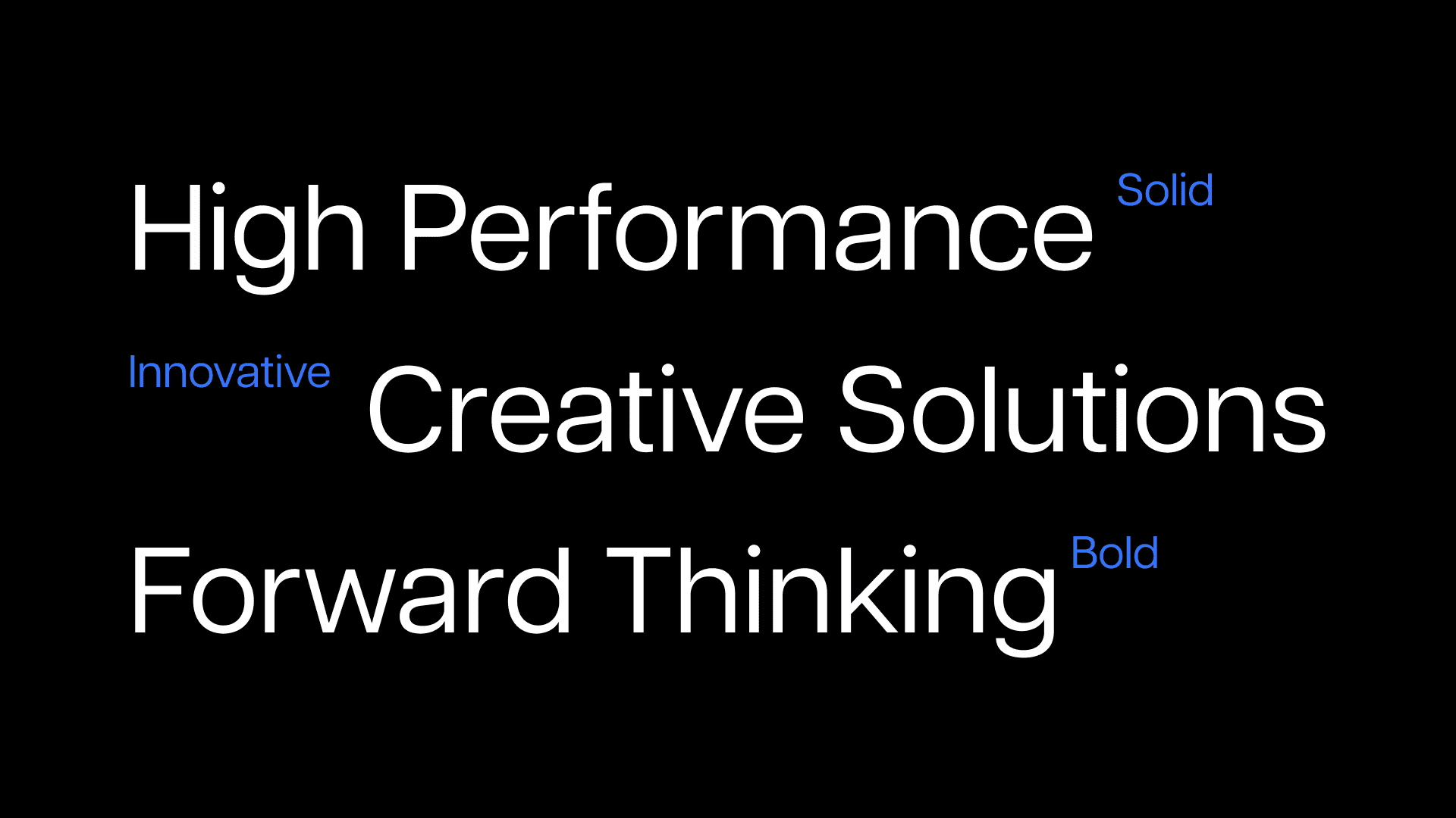
At the core of every melody lies a spark of innovation, and within each beat, pulses the heart of technology. This is the soul of Music.AI. Our brand's visual narrative explores deep blues and sharp contrasts, representing the infinite possibilities and boundless frontiers where music meets AI. The dynamic interplay of light and shadow in our imagery mirrors the complexity of soundscapes.
The Monogram Symbol
The Music.AI logo is a beacon of innovation. Its sharp angles and vibrant blue hue embody our commitment to merging the worlds of music and AI. Our purposeful language reflects our ethical stance: we provide tools to empower human creativity, not replace people. This is why we've designed a monogram that intertwines the essence of Music and the science of Artificial Intelligence with the letters "M + AI," underscoring our passion for harmonizing these two realms.

Typography & Identity
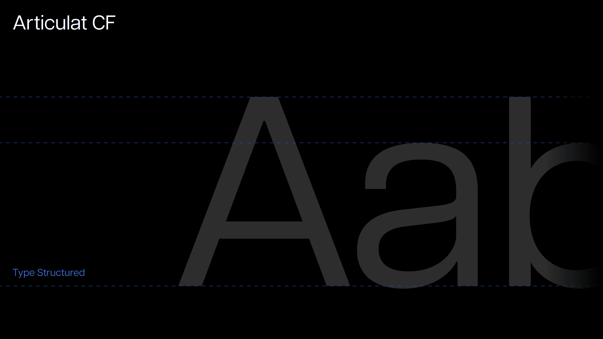
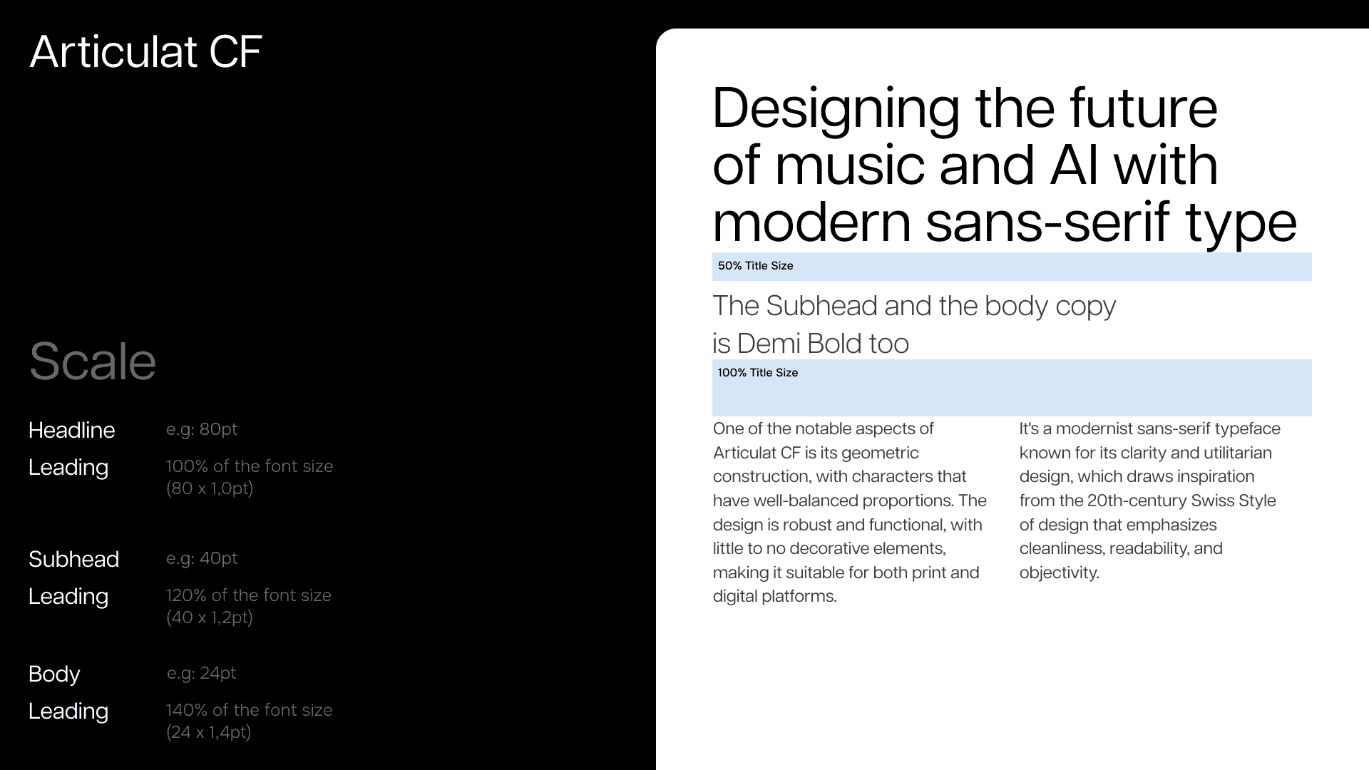
Our choice of the Articulat font family is deliberate. Its geometric nuances harmonize clean lines with balanced proportions, encapsulating the clarity and fluidity that our brand stands for, ensuring our message resonates, whether on a digital screen or in print.
Colors & Patterns
The choice of color palette is instrumental in conveying our brand’s narrative. Deep blues signify both the depth of the creative mind and the vastness of technological possibilities.
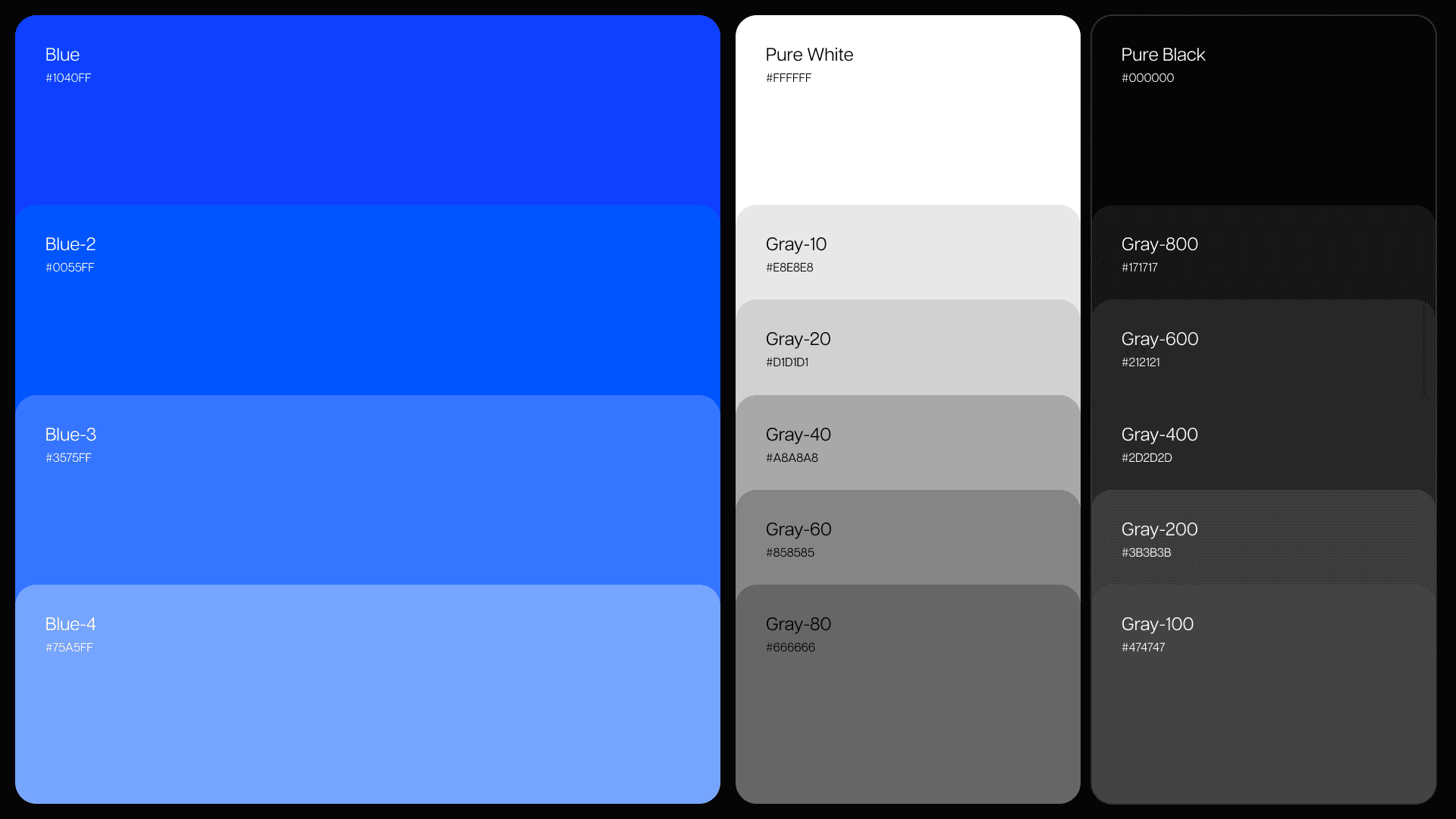
They are complemented by stark contrasts that draw inspiration from digital screens and interfaces. This contrast mirrors the collaborative dance between human musicianship and artificial intelligence—where tradition meets the digital frontier.
The background patterns evoke digital glass textures, reminding users of the woven fabric of code that underpins our platform.
Team
We're incredibly proud of where we are today and even more excited about where we're headed. Thank you to our amazing team, our supportive community, and everyone who's been a part of this journey. Here's to a new chapter in the symphony that is our shared adventure in innovation and music.
Beth Silva
Design & Creative Direction
Edi Rodrigues
3D & Motion Design
Diego Naive
Logo Design & Product Design
Rodrigo Lins
Design & Art Direction
Thiago Mendes
Systems, Product Design
Michael Nevis
VP Marketing & Communications
Hugo Fabricio
Front-end, Web Developer
Glausto Filho
Audio Engineer
Check out the complete project on Behance